Micro.blog Styles

A collection of styles to spice up your blog.
Just copy the styles you like, head over to ‘Design → Edit CSS’, and paste them in. Tada! 🎉
Please note that you might have to do some tweaking to make some of the styles play nicely with your theme (I’m using the mnml theme myself).
Contents
🌈 Rainbow logo
✨ Sparkling title
🌼 Avatar shapes
😎 Emoji menu
💬 Reply bubbles
📝 Notes styles
📃 Blogroll styles
✍️ Guestbook styles
🍔 Hamburger menu
🖨️ Print styles
📚 Books category styles
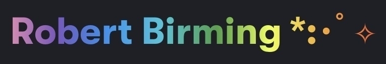
🌈 Rainbow logo
Want to sprinkle some rainbow magic over your blog? Use it during Pride Month, or why not keep the joy going all year round? Rainbows never go out of style!
Title
/* Rainbow title */
.site-title {
  font-size: 2.5rem; /* Your title size */
  background: linear-gradient(to right, #ef5350, #f48fb1, #7e57c2, #2196f3, #26c6da, #43a047, #eeff41, #f9a825, #ff5722);
  -webkit-background-clip: text;
  -webkit-text-fill-color: transparent;
}
Avatar
/* Rainbow avatar */
.u-photo {
  height: 50px; /* Your avatar size */
  width: 50px;
  background: linear-gradient(to right, #ef5350 0%, #f9a825 25%, #43a047 50%, #26c6da 75%, #2196f3 100%) border-box;
  background-clip: border-area;
  -webkit-background-clip: border-area;
  border: 3px solid #0000;
  border-radius: 50%;
}
⬆️ Back to menu
✨ Sparkling title
Inspired by the lovely gradient sparkles by Sylvia, this little snippet of code will make your blog title sparkle with eternal joy — like fairy dust for your header!
/* Colors: Light mode */
:root {
  --text-color: #4c4f69;
  --gradient: linear-gradient(90deg, #4c4f69 0%, #8839ef 50%, #ea76cb 100%);
}

/* Colors: Dark mode */
@media (prefers-color-scheme: dark) {
  :root {
    --text-color: #cdd6f4;
    --gradient: linear-gradient(90deg, #cdd6f4 0%, #cba6f7 50%, #f5c2e7 100%);
  }
}

/* Sparkling the magic */
.site-title::after {
  padding-left: 5px;
  content: "*:・゚✧";
  background: var(--gradient);
  color: transparent;
  background-clip: text;
}
⬆️ Back to menu
🌼 Avatar shapes
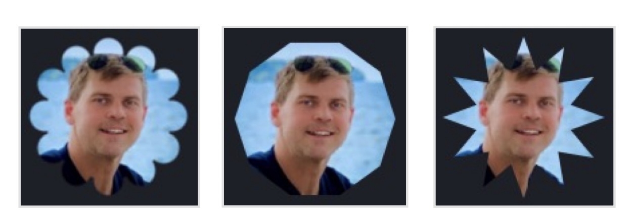
Pump up your blog one notch by giving your avatar a little makeover. You can choose between three stylish shapes: flower, octagon, or a spiked star. Because who says your face can’t be framed like a work of art?
Flower
/* Flower avatar */
.u-photo {
  height: 50px; /* Your avatar size */
  width: 50px;
  --g:/20.56% 20.56% radial-gradient(#000 calc(71% - 1px),#0000 71%) no-repeat;
  mask: 100% 50% var(--g),93.301% 75% var(--g),75% 93.301% var(--g),50% 100% var(--g),25% 93.301% var(--g),6.699% 75% var(--g),0% 50% var(--g),6.699% 25% var(--g),25% 6.699% var(--g),50% 0% var(--g),75% 6.699% var(--g),93.301% 25% var(--g),radial-gradient(100% 100%,#000 38.366%,#0000 calc(38.366% + 1px));
}
Octagon
/* Octagon avatar */
.u-photo {
  height: 50px; /* Your avatar size */
  width: 50px;
  clip-path: polygon(100% 50%,90.45% 79.39%,65.45% 97.55%,34.55% 97.55%,9.55% 79.39%,0% 50%,9.55% 20.61%,34.55% 2.45%,65.45% 2.45%,90.45% 20.61%);
}
Star
/* Star avatar */
.u-photo {
  height: 50px; /* Your avatar size */
  width: 50px;
  clip-path: polygon(100% 50%,78.98% 57.76%,93.3% 75%,71.21% 71.21%,75% 93.3%,57.76% 78.98%,50% 100%,42.24% 78.98%,25% 93.3%,28.79% 71.21%,6.7% 75%,21.02% 57.76%,0% 50%,21.02% 42.24%,6.7% 25%,28.79% 28.79%,25% 6.7%,42.24% 21.02%,50% 0%,57.76% 21.02%,75% 6.7%,71.21% 28.79%,93.3% 25%,78.98% 42.24%);
}
⬆️ Back to menu
😎 Emoji menu

Why settle for plain text when you can swap menu links for emojis? Turn “Home” into 🏠, “Blog” into ✍️ — and add a playful touch to your site.
.nav-item a[href$="/about/"] {
  text-indent: -9999px;
  display: inline-block;
  line-height: .1;
}
.nav-item a[href$="/about/"]:after {
  text-indent: 0;
  display: flex;
  justify-content: flex-end;
  margin-left: auto;
  line-height: 0;
}
.nav-item > a[href$="/about/"]:hover {
  text-decoration: none;
  transform: scale(1.2);
  transition: transform 0.3s ease;:
}
.nav-item a[href$="/about/"]:after {
  content: "👀";
}
⬆️ Back to menu
💬

Tired of your replies looking like they came from a tax form? Add a splash of fun with this CSS snippet that turns your plain old messages into playful speech bubbles.
/* Replies */
.reply {
  position: relative;
  margin: 20px;
}
.reply:nth-child(even) {
  background: var(--accent-1);
}
.reply:nth-child(odd) {
  background: var(--accent-2);
}
.reply:nth-child(even):after {
	position: absolute;
	margin-top: -20px;
	margin-left: -20px;
	content: '';
	left: 0;
	top: 50%;
	width: 0;
	height: 0;
	border: 20px solid transparent;
	border-right-color: var(--accent-1);
	border-left: 0;
}
.reply:nth-child(odd):after {
	position: absolute;
	margin-top: -20px;
	margin-right: -20px;
	content: '';
	right: 0;
	top: 50%;
	width: 0;
	height: 0;
	border: 20px solid transparent;
	border-left-color: var(--accent-2);
	border-right: 0;
}
Not your cup of tea? Try these styles instead. They’ll turn each reply into a neat little speech bubble, with the arrow pointing to the left. See my replies page for an example.
/* Replies */
.reply {
  position: relative;
  padding: 1.6rem 2rem;
  margin-bottom: 2rem;
  border-radius: var(--border-radius);
  background: var(--accent-1);
}
.reply:nth-child(even) {
  background: var(--accent-2);
}
.reply .post-date {
  font-size: 1.4rem;
  margin-bottom: 0.8rem;
  opacity: 0.7;
}
.reply .post-date a {
  color: var(--text);
}
.reply p {
  margin: 0;
  font-size: 1.7rem;
}
.reply::before {
  content: "";
  position: absolute;
  top: 1.2rem;
  left: -12px;
  border-width: 10px 12px 10px 0;
  border-style: solid;
  border-color: transparent var(--accent-1) transparent transparent;
}
.reply:nth-child(even)::before {
  border-color: transparent var(--accent-2) transparent transparent;
}
⬆️ Back to menu
📝 Notes styles
Want to make your short posts stand out? Use this little snippet of code to turn your tiny posts into mighty digital post-its. Small but impossible to ignore!
Please note (no pun intended): Change the .notes part to match the name of the category you’d like to give the post-it look.
/* Notes styles */
.notes {
  background-color: #ffc;
  background-size: 20px 20px;
  background-image: repeating-linear-gradient(0deg, #ddd, #ddd 1px, #ffc 1px, #ffc);
}
.notes p {
  font-family: monospace;
  font-size: 1.6rem;
  color: #555;
  letter-spacing: -.5px;
}
.notes a {
  color: #555;
  text-decoration: underline;
  text-decoration-thickness: 2px;
  text-underline-offset: 0.25em;
}
.notes .post-date a {
  text-decoration: none;
}
⬆️ Back to menu
📃 Blogroll styles

Your blogroll deserves to look as good as the people on it make you feel. Here’s the style that will do just that! To learn more, check out the Micro.blog blogroll styles page.
/* Blogroll */
ul.blogroll {
  display: grid;
  grid-template-columns: repeat(auto-fit, minmax(22ch, 1fr));
  gap: 1rem;
  margin: 2em 0;
  padding: 0;
  list-style: none;
  font-size: 1.7rem;
}

ul.blogroll li {
  display: flex;
  flex-direction: column;
  background-color: var(--accent-1);
  border-radius: var(--border-radius);
  border: 1px solid var(--accent-2);
  padding: 1em 1.5em;
  overflow-wrap: anywhere;
}

ul.blogroll a {
  font-weight: var(--font-weight-bold);
}

.blogroll_about {
  margin: .2em 0;
  line-height: 1.5;
}
⬆️ Back to menu
✍️ Guestbook styles
Using the lovely Guestbook by Meadow? No? You really should. Guestbooks never go out of style.
If you want to give your entries a bit of rhythm, one shade and then another, you can do it with just a few lines of CSS. That’s how I’ve styled my guestbook. Just swap out the colors below to match your theme.
/* Guestbook */
#guestbooks___guestbook-messages-container > div {
  background: var(--color-1);
}
#guestbooks___guestbook-messages-container > div:nth-child(even) {
  background: var(--color-2);
}
⬆️ Back to menu
🍔 Hamburger menu

These snippets let you spice up your small screen hamburger menu with tasty layers and yummy side orders.
/* Hamburger */
.hamburger {
  margin: 4px 0 0;
}
.hamburger .bar {
  display: block;
  width: 20px; /* Burger width */
  height: 3px;
  margin: 3px 0;
  border-radius: 2px;
}
.site-nav .hamburger .bar:nth-child(1) {
  background-color: red; /* Top bun color */
}
.site-nav .hamburger .bar:nth-child(2) {
  background-color: blue; /* Burger color */
}
.site-nav .hamburger .bar:nth-child(3) {
  background-color: green; /* Bottom bun color */
}
⬆️ Back to menu
🖨️ Print styles
Keeps printouts tidy, saves some trees, and spares readers from never-ending PDFs and bitter faces.
/* General print styles */
@media print {
  body {
    font-size: 12pt;
    line-height: 1.5;
    color: #000;
    background: #fff;
  }

  /* Hide elements not needed for print */
  .header,
  .site-nav,
  .post-date a,
  .main-nav,
  footer,
  .to-top,
  .pinned-badge,
  .post-title a:link::after,
  .post-date time::after,
  #comments,
  .microblog_comments,
  #conversation,
  [id^="conversation"],
  .conversation,
  .conversation-container,
  .conversation-thread,
  .conversation-replies,
  .mb-conversation,
  .webmention,
  .comments,
  .replies,
  script[src*="conversation.js"],
  main > script[src*="conversation.js"] + *,
  main > script[src*="conversation.js"] ~ .conversation,
  main > script[src*="conversation.js"] ~ #conversation {
    display: none !important;
  }

  /* Article layout */
  main {
    max-width: 100%;
    margin: 0;
    padding: 0;
  }

  article {
    border-bottom: 1px solid #ccc;
    padding-bottom: 1rem;
    margin-bottom: 1.5rem;
    page-break-inside: avoid;
  }

  /* Typography */
  h1,
  h2,
  h3,
  h4,
  h5,
  h6 {
    color: #000;
  }

  .post-title {
    font-size: 16pt;
  }

  .post-date {
    color: #000 !important;
  }

  /* Links */
  a:link,
  a:visited {
    color: #000;
    text-decoration: underline;
  }

  a[href]:after {
    content: " (" attr(href) ")";
    word-break: break-all;
    font-size: 80%;
  }

  /* Images and media */
  img {
    max-width: 100% !important;
    display: block;
  }

  .microblog_collection img,
  .e-content img,
  .p-summary img {
    border: none;
    box-shadow: none;
    page-break-inside: avoid;
  }

  /* Page settings */
  @page {
    margin: 1cm;
  }
}
⬆️ Back to menu
📚 Books category styles
Give the books you blog about the style they deserve. Take a look at my Books category for an example. If needed, just change the books class to match the name of your own category (for example read).
/* Books */
article.books {
  display: grid;
  grid-template-columns: 70px 1fr;
  grid-template-rows: auto auto auto;
  gap: 1.2rem;
  align-items: start;
  background: var(--accent-1);
  border: 1px solid var(--accent-2);
  border-radius: var(--border-radius);
  padding: 1.6rem;
  margin-bottom: 3rem;
}
article.books:last-of-type {
  margin-bottom: 0;
}
article.books img.microblog_book {
  grid-column: 1;
  grid-row: 1 / 4;
  width: 60px !important;
  height: auto !important;
  margin: .4rem 0 0 0 !important;
  border-radius: 0 !important;
  box-shadow: 0 4px 6px rgba(0,0,0,.18);
}
@media (prefers-color-scheme: dark) {
  article.books img.microblog_book {
    box-shadow: 0 4px 6px rgba(0,0,0,.35);
  }
}
article.books p {
  grid-column: 2;
  margin: 0 0 .6rem;
}
article.books .post-date {
  grid-column: 2;
  grid-row: 3;
  margin-top: 1rem;
  font-size: 1.5rem;
  color: var(--accent-3);
}
article.books .post-date a {
  color: var(--accent-3);
}
article.books .post-date a:hover {
  color: var(--link-hover);
}
article.books p:not(.post-date):not(:has(a[href*="micro.blog/books"])) {
  font-style: italic;
}
article.books p:has(a[href*="micro.blog/books"]) a {
  text-decoration: underline;
  text-underline-offset: 3px;
}
⬆️ Back to menu
Watch this space
I will continue to update this page with more styles. If you’ve created some styles you think would be a good fit for this page, please let me know. I’ll gladly give you credit if I include them!